NGO Platform for Meaningful Connections
Cahoot, a social platform bridging the gap between NGOs and passionate volunteers
Reversing Declining sales and visitor attendance rate through innovative digital solution
May 2023 - July 2023
Project Background
Cahoot is a digital platform and an idea pitched to a local stakeholder. It aims to bring together all do good organizations (NGO) together and bringing them a step closer to the people, who wish to participate and volunteer for social good.
It is one stop for people to visit - understand, educate , participate. They can educate themselves about globally pressing issues, the work done by various organizations and decide for themselves where they would like to contribute. This is bringing them closer to NGOs as they do not have to put efforts to ensure about the credibility as well.
Problem
With global pressing challenges, we have lot of do organizations around the world, contributing to make a larger impact. But there is a huge gap between them and the volunteers. NGOs due to lack of time to campaign, poor outreaching and funds, are unable to fulfill their goals. Volunteer and conscious citizens who wish to contribute are unable to find them easily and the gap just keeps on increasing.
Overall, the gap between NGOs and volunteers is a significant challenge that requires greater attention and investment. To address this gap, NGOs need to prioritize outreach and communication strategies that can help them connect with volunteers and conscious citizens.
1. One of the primary issues that NGOs face is a lack of resources, including time and funding. They struggle to attract the attention of potential volunteers and supporters.
2. NGOs lack communication skills to effectively reach out, which creates a significant barrier for volunteers and conscious citizens who wish to contribute to these causes but are unable to find or connect with relevant NGOs.
3. NGOs and volunteers can also be exacerbated by geographic and cultural differences.
4. Conscious citizens who wish to contribute, need to put in lot of efforts to reach the NGO and also find it difficult to ensure the credibility of the resource.
Goals
The major goal is to address the gap between the NGOs and volunteer.
1. An attempt to blur the boundary between these do good organization who are trying to reach people for financial aid.
2. To put out the maximum word to volunteers and encourage them to contribute to the cause they wish to be part of.
3. To provide a platform where NGOs can reach people easily reducing the time they will need to invest in campaigning.
4. To provide a marketing platform, where NGOs do not have to depend on "accidental marketing" - as flyers and IG Ads become fugitive after a point
5. Where people or conscious citizens can educate themselves from one common platform and participate in various events taking place around.
6. A resource full platform, where people can refer to as one stop solution and remind themselves of their motives to contribute regularly.
Design Process involved intuitive & natural approach to product development
Research and Understanding Pain Points > Analyzing and Defining Problem Statement > Iteration and Prototyping
User Research
Interviews and surveys were conducted as a part of the user research phase. It was known that a chunk of people wish to participate in social good. Volunteer and conscious citizens who wish to contribute are unable to find them easily and the gap just keeps on increasing. However they fail to do so every time the wish to due to following reasons -
1. Lack of time to personally dedicate into researching the NGOs, their work and the credibility.
2. "Accidental Marketing" or when they come across any ads , but never able to follow up on them.
3. Unsure of what organization actually needs the help.4. They do not wish to spend a lot of time .
5. They will be motivated to do if something and contribute if it is easily accessible.
The User Research aimed at answering the design questions emphasized above
User Research also constituted the use of Empathy Maps, used to Understand the User group -
their pain points and challenges
Understanding the Users - User Persona
Persona 1
Age - 26
Occupation - College Student
"I am an MBA student and an enthusiastic volunteer in campus activities. As todays youth I am aware of global issues and wish to do my bit"
Goals
1. Is concerned about global challenges and wish to contribute as a conscious citizen.
2. Information that is easy to access and also ensures credibility.
Frustration
1. Lack of credible internet sources. Lots of information around.
2. The motivations and campaigning is fugitive.
3. It takes a lot of effort to look for an NGO within a pool of information.
Persona 2
Age - 40
Occupation - Start-up founder
“I am a Tech co. founder. I keep myself aware about everyday happenings. I wish to associate with more organizations to learn and grow everyday.”
Goals
1. Wishes to participate and network with organizations on regular basis.
2. To associate for a long time relationship with the NGOs for the cause they work for.
3. Easier and less time consuming methods.
4. Easy to maintain as a habit and also less complication.
Frustration
1. Difficult to specially take out time and find NGOs working for the cause she and here company supports.
2. The campaigns and advertisements they come across are short-lived and tend to forget with their busy schedule without any follow up.
Bridging the Gap
The user journey map is giving here a visual representation of the steps the user goes through while trying to buy a product form h.u.e. Art gallery. The journey map here typically highlights the different touchpoints, including the user's emotional and behavioral responses at each point until the completion of the task.
Site Map
Understanding the IA of the website with the Site Map to to gear up with conceptualizing and Ideation phase
Ideation
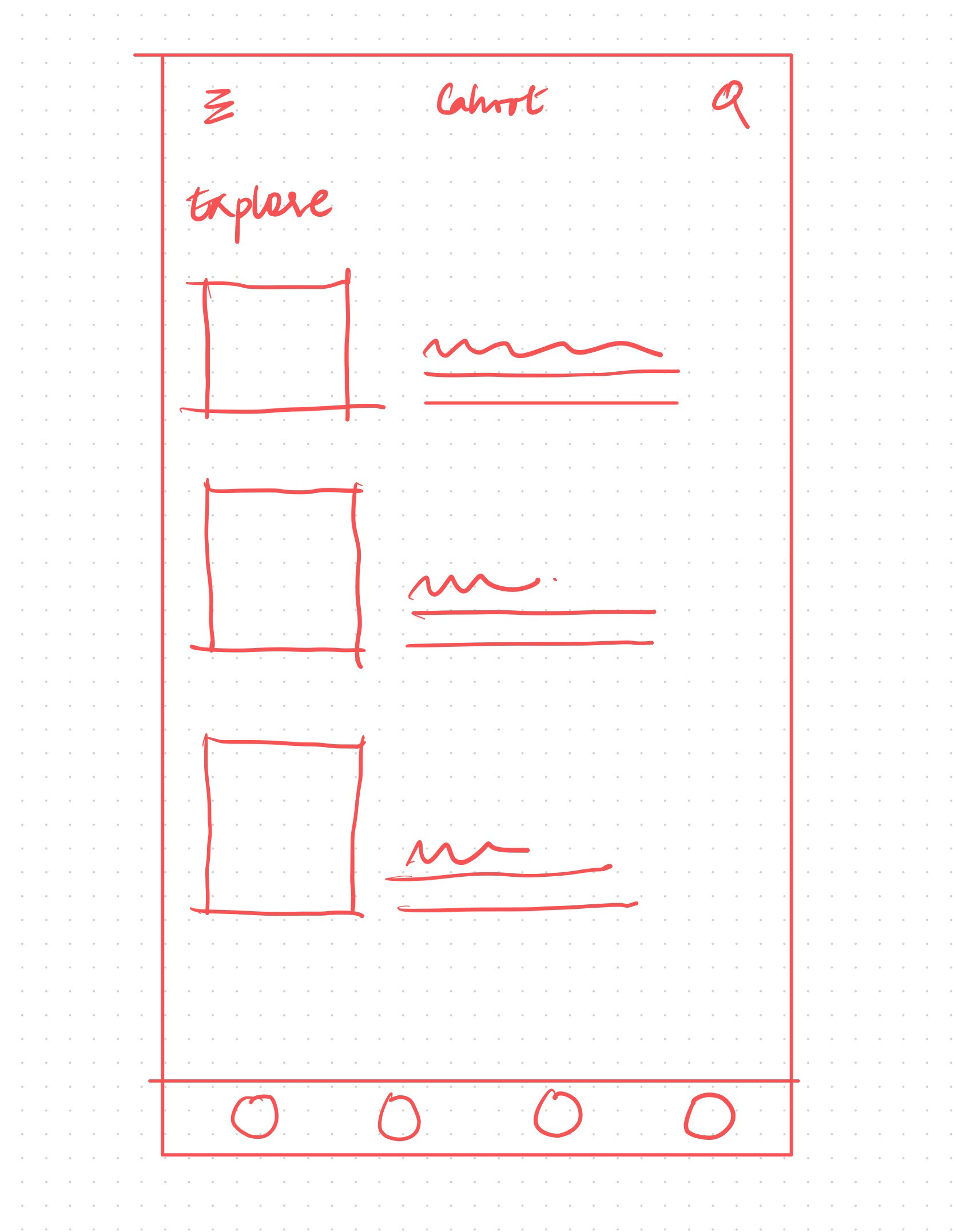
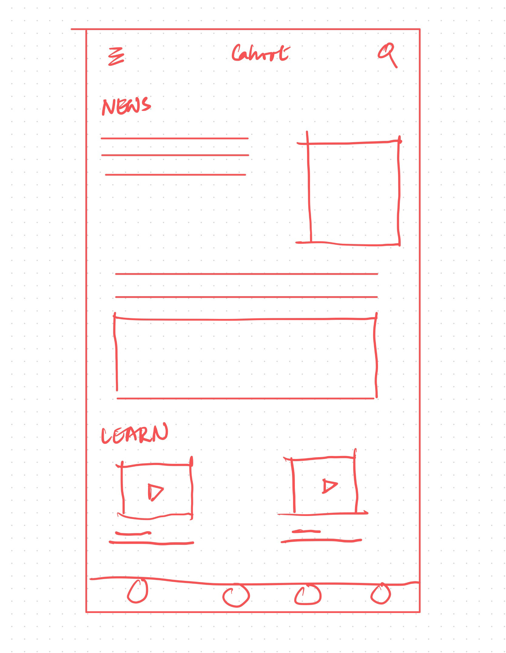
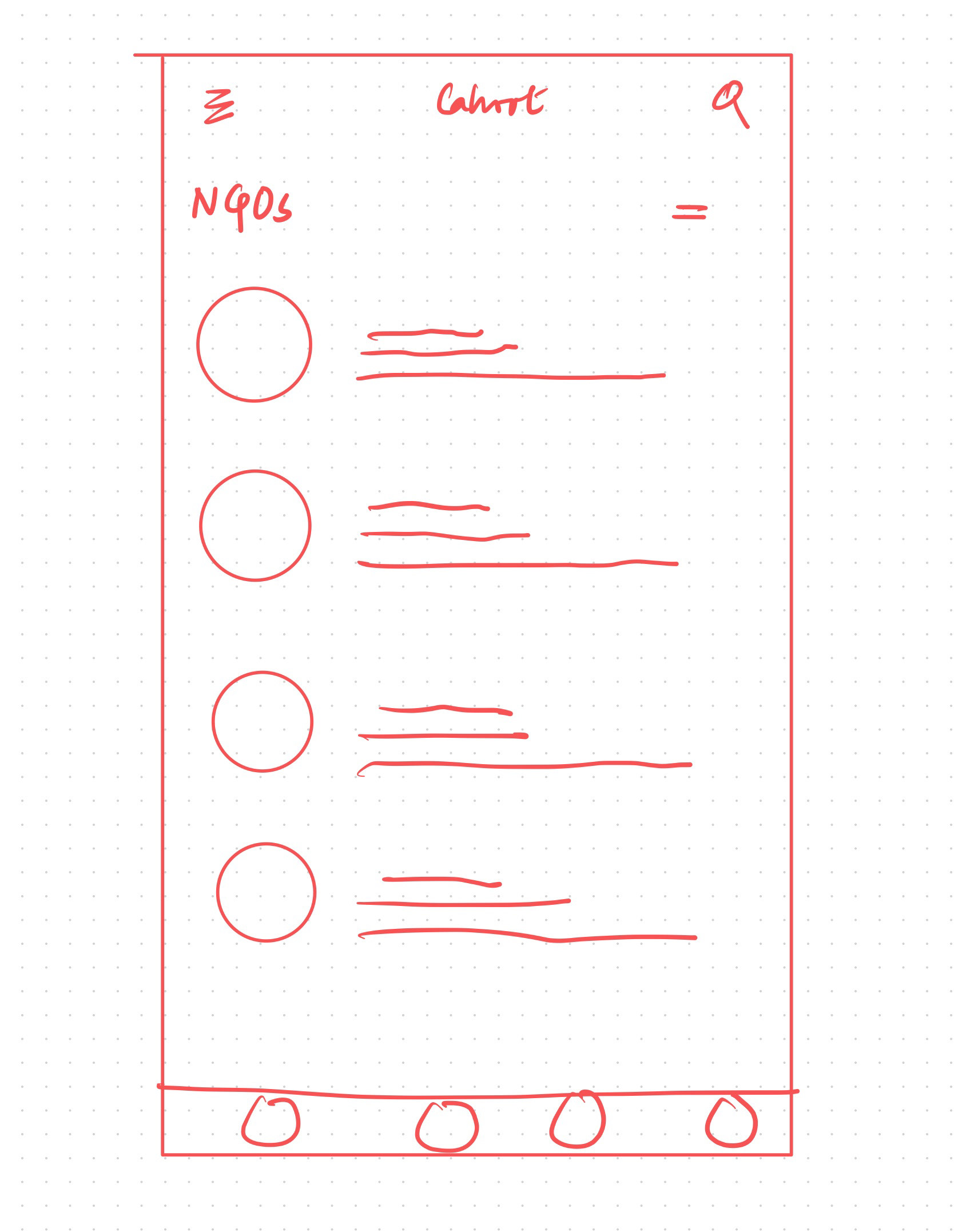
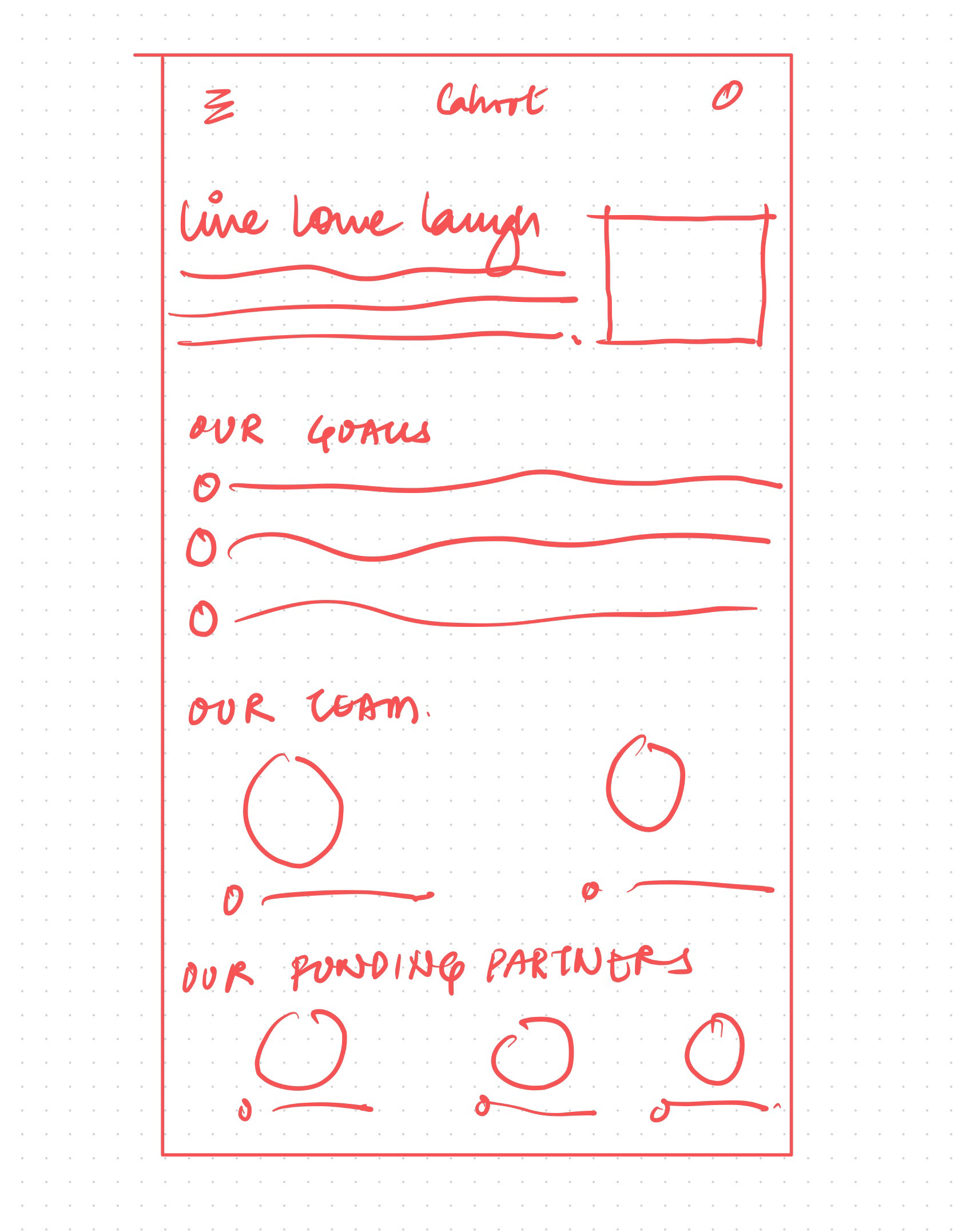
Based on the research gathered Initial sketches were brainstormed . These sketches were based to understand IA of the App and the most important function, the app will need in order to serve the user needs and challenging their painpoints. Paper Wireframes created after user research to get the best understanding of the IA for the mobile app and desktop website


Digital Wireframes
Digital wireframes and lo-fi prototype were created after ideation process. Based on what Information Architecture works best for an easy shopping experience, these lo-fi prototypes were created for the prototyping stage.
They were used for usability study to give an in depth understanding of the user experience and the challenges faced while using the App. The user feedback after using the prototype created a scope of design iterations that the App might need for a better user flow.
Hi-Fidelity Prototype - Website Design
Final mock-ups were created with design iterations after usability study was conducted using the lo-fidelity prototype. The iterations were made considering the insights gathered after the study. Let's take a look of the final design of the Website design
How Cahoot Works -
Cahoot provides a people to visit - understand, educate , participate.
Cahoot Website homepage has a simple interface for any user to start with for the first time. It shows various information they can access and explains how Cahoot actually works
Learn > Participate > Donate
1. "Learn" - Educate yourself
2.1 "Participate" - Know our NGOs
2.2 "Participate" - Know events by NGOs
3. "Donate" - Help us contributing your bit
Donate and Earn Reward Points
-Donate
-Invite friends/family
-Volunteer
Hi-fidelity Mock ups of Mobile App for Cahoot